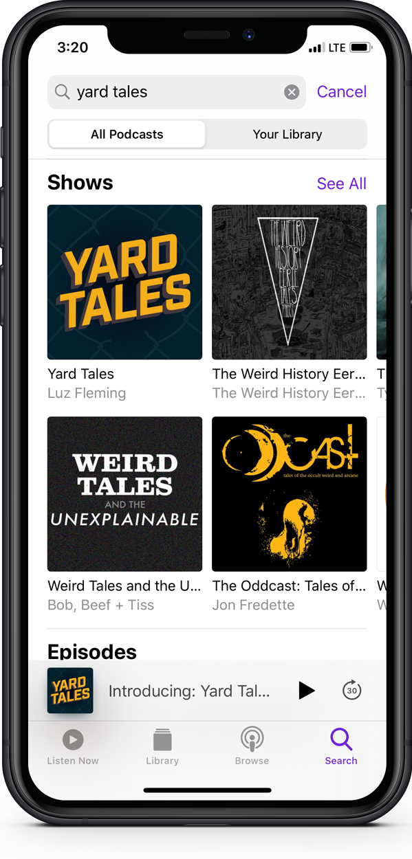
YARD TALES
Why Do We Enter Forbidden Space?
Yard Tales is a podcast that explores forbidden space from both sides of the tracks—the train and bus yard, the tenement yard, the prison yard and border. In first-person audio narratives, Yard Tales details close calls and chase stories, and explores larger conversations about crossing boundaries, the other side of the tracks, frontiers, and forbidden space.
Role: Creative direction, brand identity

Whom among us has not seen a hole in a fence, and not felt
THE CALL OF ADVENTURE?
To create a visual identity for Yard Tales, I drew on the experience of crossing physical boundaries, which are often demarcated with chain link fence and barbed wire. Although it may appear impenetrable, chain-link fencing is easily severed with a common pair of bolt cutters or lineman’s pliers. The metallic “clink” of a severed strand signifies a step toward the other side, the creation of a portal into forbidden space.
UNDER COLOR OF DARKNESS
Many of the stories told in Yard Tales episode transpire at night, under cover of darkness. While citizens sleep, deep shadows provide cover, and authorities are short staffed, our protagonists make moves to cross into forbidden space. The light they are guided by is artificial, with alien monotones that flatten vision.
High powered flood lights color the world of the yard, street and border, creating an unnatural palette of bright tones in the darkness. The night world is lit with the eerie green cast of metal halide and acid yellows of high pressure sodium. Indigo skies are washed in glows of green and brown. Graffiti writers, urban explorers and border crossers move stealthily through this luminescence playing a cat and mouse game with sentries.
The Yard Tales color palette is rooted in the tones of artificial light produced by high-powered lighting used to illuminate city streets, train yards, borders and other loacations where Yard Tales unfold. The deep, alien greens and teals projected by metal halide lamps are paired with the monochromatic tungsten tones of high pressure sodium bulbs.
THE TYPOGRAPHY OF DANGER
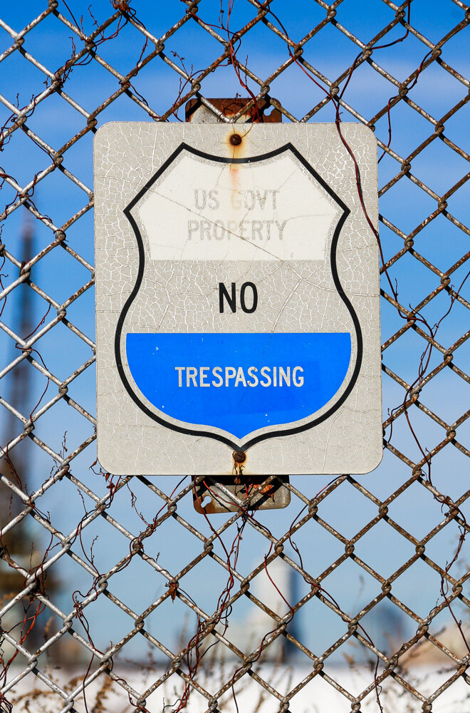
Yard Tales’s protagonists are often confronted with—and defy—the typography of authority. No Trespassing. Do Not Enter. Keep Out. Bolted securely to fences and walls, the voice of authority speaks in all caps, clearly declaring the barrier may not be crossed. But they are.
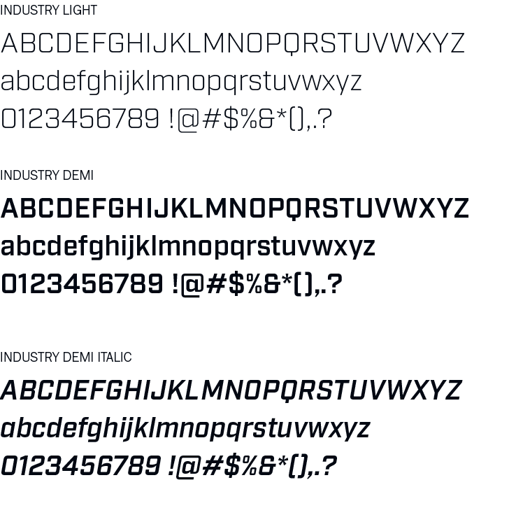
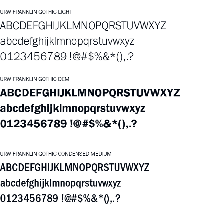
Industry, the primary typeface used for Yard Tales references the squared-off lettering used on mid-Twentieth century warning signs. It is coupled with URW Franklin Gothic, a workhorse sans serif also found in industrial and signage applications.
KEY ART
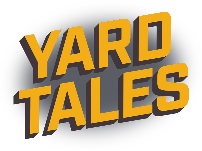
The Yard Tales key art is constructed of three elements: a dark green gradient, referencing the wash of metal halide lighting and shadows of the night; a chain link fence graphic with a hole cut in it; and an angled and extruded wordmark, colored as if in the wash of high-pressure sodium lamps.
The wordmark springs forward from the background, bursting out of the fence. The 3D extrusion gives the typography heft and a nod to the lettering styles used in graffiti , a common focus of the stories told on Yard Tales.
